How I Saved Time on Frontend Development Using shadcn Components (And Made It Look Better Too)
As a developer, I'm always on the lookout for tools and strategies that help me save time without sacrificing quality. Recently, I discovered shadcn components, and they have been a game-changer for my projects. Here's how I leveraged them to not only speed up my development process but also improve the aesthetics of my applications. For context, I'm Building LiveAPI: A Super-Convenient tool which you can use to generate API documentations instantly with just a click of a button. So, for making the user experience better I had to look for ways to get it done quick and elegantly, Thats how I Found shadcn. The Challenges of Frontend Development Frontend development can be time-consuming. Between designing layouts, implementing interactivity, and ensuring everything looks polished across devices, it's easy to get bogged down in the details. While component libraries like Material UI or Bootstrap are popular, they often feel generic and require extensive customization to achieve a unique look. I needed a solution that: Allowed for rapid development. Was customizable to fit unique design requirements. Produced visually appealing components out of the box. This is where shadcn components entered the picture. Why shadcn Components? shadcn is a modern, design-focused component library that emphasizes flexibility and aesthetics. What sets it apart is: Beautiful Default Styles: The components look great out of the box, saving time on design tweaks. Customizable: Built with Tailwind CSS, shadcn components are easy to theme and modify. Accessible: Accessibility is baked into the components, ensuring a better user experience for everyone. Productivity-Focused: Ready-to-use components mean less time spent reinventing the wheel. How I Used shadcn Components to Save Time 1. Pre-Built Components for Rapid Prototyping One of the biggest time-savers was the extensive library of pre-built components. From buttons and modals to navigation menus and form elements, I had access to everything I needed to build a fully functional UI. This allowed me to focus on the application's core functionality rather than the UI from scratch. 2. Tailwind CSS for Easy Customization shadcn components integrate seamlessly with Tailwind CSS. By leveraging utility classes, I could quickly tweak styles to match the branding of my projects. For example, adjusting colors, typography, and spacing was as simple as updating a few Tailwind classes. 3. Consistent Design Language Using shadcn components ensured design consistency across the application. Instead of manually aligning elements or tweaking margins, I relied on the library's design system, which saved countless hours. 4. Focus on Accessibility Building accessible applications can be challenging, but shadcn components made it easy. With ARIA attributes and keyboard navigation built in, I could be confident my apps met accessibility standards without additional effort. The Aesthetic Boost Apart from the time savings, shadcn components significantly improved the visual appeal of my projects. The components are designed with modern UI principles in mind, featuring: Clean, minimalistic designs. Smooth hover and focus states. Thoughtful spacing and typography. These default styles ensured my applications looked professional without requiring extensive design work. Conclusion Switching to shadcn components has been one of the best decisions I've made as a frontend developer. By leveraging their pre-built, customizable, and accessible components, I was able to save time and deliver visually stunning applications. If you're looking for a way to speed up your frontend development while improving your UI's aesthetics, I highly recommend giving shadcn components a try. Your future self (and your users) will thank you! Here is a demo of LiveAPI, and see the ShadCN components in action!

As a developer, I'm always on the lookout for tools and strategies that help me save time without sacrificing quality. Recently, I discovered shadcn components, and they have been a game-changer for my projects. Here's how I leveraged them to not only speed up my development process but also improve the aesthetics of my applications.
For context, I'm Building LiveAPI: A Super-Convenient tool which you can use to generate API documentations instantly with just a click of a button.
So, for making the user experience better I had to look for ways to get it done quick and elegantly, Thats how I Found shadcn.
The Challenges of Frontend Development
Frontend development can be time-consuming. Between designing layouts, implementing interactivity, and ensuring everything looks polished across devices, it's easy to get bogged down in the details. While component libraries like Material UI or Bootstrap are popular, they often feel generic and require extensive customization to achieve a unique look.
I needed a solution that:
- Allowed for rapid development.
- Was customizable to fit unique design requirements.
- Produced visually appealing components out of the box.
This is where shadcn components entered the picture.
Why shadcn Components?
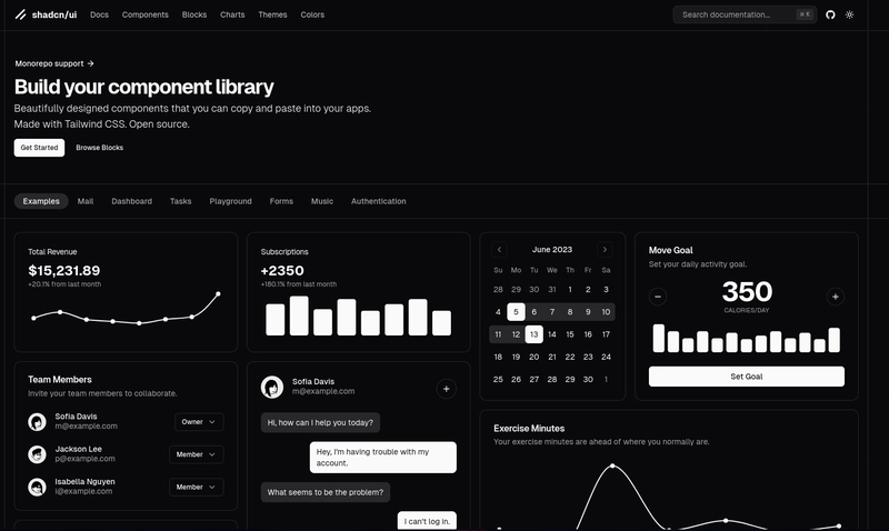
shadcn is a modern, design-focused component library that emphasizes flexibility and aesthetics. What sets it apart is:
- Beautiful Default Styles: The components look great out of the box, saving time on design tweaks.
- Customizable: Built with Tailwind CSS, shadcn components are easy to theme and modify.
- Accessible: Accessibility is baked into the components, ensuring a better user experience for everyone.
- Productivity-Focused: Ready-to-use components mean less time spent reinventing the wheel.
How I Used shadcn Components to Save Time
1. Pre-Built Components for Rapid Prototyping
One of the biggest time-savers was the extensive library of pre-built components. From buttons and modals to navigation menus and form elements, I had access to everything I needed to build a fully functional UI. This allowed me to focus on the application's core functionality rather than the UI from scratch.
2. Tailwind CSS for Easy Customization
shadcn components integrate seamlessly with Tailwind CSS. By leveraging utility classes, I could quickly tweak styles to match the branding of my projects. For example, adjusting colors, typography, and spacing was as simple as updating a few Tailwind classes.
3. Consistent Design Language
Using shadcn components ensured design consistency across the application. Instead of manually aligning elements or tweaking margins, I relied on the library's design system, which saved countless hours.
4. Focus on Accessibility
Building accessible applications can be challenging, but shadcn components made it easy. With ARIA attributes and keyboard navigation built in, I could be confident my apps met accessibility standards without additional effort.
The Aesthetic Boost
Apart from the time savings, shadcn components significantly improved the visual appeal of my projects. The components are designed with modern UI principles in mind, featuring:
- Clean, minimalistic designs.
- Smooth hover and focus states.
- Thoughtful spacing and typography.
These default styles ensured my applications looked professional without requiring extensive design work.
Conclusion
Switching to shadcn components has been one of the best decisions I've made as a frontend developer. By leveraging their pre-built, customizable, and accessible components, I was able to save time and deliver visually stunning applications.
If you're looking for a way to speed up your frontend development while improving your UI's aesthetics, I highly recommend giving shadcn components a try. Your future self (and your users) will thank you!
Here is a demo of LiveAPI, and see the ShadCN components in action!


